Code

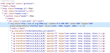
The image is of code for the opening "V" animation and shows some of the paths and
coding necessary to put the ball in motion, or should I say, the colored balls in motion.
There are many attributes and paths used for the animations, transform and translate is noticeably being use to lay out the scaled vector graphic movement and positioning.
User Interface - UI

The organization and the structure is done very well. There are tutorials to engage yourself into and numerous developed color palette schemes that are available to download. The distinct areas of focus was signified by a well-structured menu and abundant content shared by Veerle and other free-source developers.
User Experience - UX

The color palette used is inviting and colorful, using soft pastels to welcome a new visitor to her? website. I started reading about building a lighthouse with various vector shapes in a step-by-step tutorial, and scanned through various articles to find inspiration, as it had a very soothing platform to engage with. You can tell that Veerle has committed a lot of time to her projects and has so much to offer to designers at all levels, as all her stuff is free to use, even the proven color patterns!
SUMMARY
Veerle will be a site that I refer to often when I need some inspiration, or have the time to go discover some new content again. Possibly will surf a little more into some of these interesting ideas and projects that she offers. Overall, a pleasant experience with full of color, but not too strong, which gives the site a pleasing and welcoming vibe. There is more content that is relevant to our focus in the Veerle site and a more in depth look at some inspiration, ideas, or a tutorial!