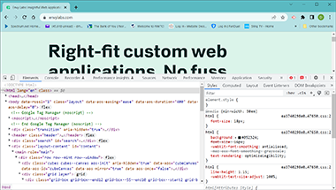
Code

Displayed is a snippet of code from the home page observed during the search
for envy. The code is interesting and I was trying to figure out where the javascript
was for the background moving cube colors. What I observed is a series of div grid boxes
that uses several classes to form the cubes seen in the background. Pretty neat. The code uses the :hover pseudo class to invoke movement when the user is hovering over the background design by using a 2D pattern design with various colors and shades to simulate a moving 3D cube structure. Outstanding!
User Interface - UI

The content of Envy seemed scattered and the interaction with the site was limited. You can sign up for more information and a subscription, but little more than that, there is not a whole lot of interaction, such as inputs for immediate actions. All the inputs were asking for your information.
User Experience - UX

I thought the overall experience was rather bland. Way too much white space between content and the colors used for the cubes was too light and not enough contrast to make the background interesting. One thing that was neat was how the background texture(3d cubes) would move, rotate colors, etc...when hovered upon. On some other pages, the darker cubes were used, but they were stationary. The site was not as inviting to the beginner coder and the information was spread out so much, I really was not sure what the site's main purpose, to help, read articles, or sell a service?... was how I felt when all was read, said and done.
Summary
Although the white space and unused areas left me with an empty feeling, I could see where the content is relevant to explore. I am planning on checking out a few of the case studies as I am interested in what envy does and their purpose. There is some great image effects as you scroll and the offsets for the image prior to hovering. Also, as you scroll, there are border shadows that are animated in motion, partially transparent but has the feel of a shadow collapsing.