Code

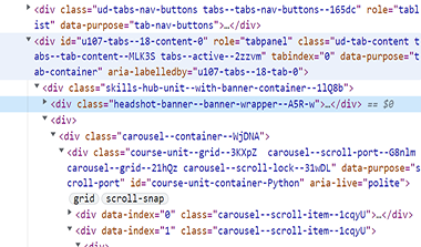
This code is of the grid design, set up using many classes and grid code. Cards are used to display the various courses and their prices. The grid, however, is not totally fully responsive. The mobile, or collapsing of window does not wrap the cards. When this is viewed in mobile, part of the 2nd card is cut off, with the third and fourth running on overflow.
User Interface - UI

I thought the UI was well set up and structured, which made it easy to read. The links were set up so you were directed to the correct location on the site. The organization and flow of the pages were easy to surf to another location. Mouse hovering effects, smooth scrolling, and the navigation all seemed to work together nicely.
User Experience - UX

Continuing education is necessary for web developers to get the most out each website. My experience was overwhelming. As I traversed through the site, there are many courses that would benefit my learning. I was impressed by the discount prices and would consider these tutorials and lessons in the future.
Summary
Udemy is a site for all types of computer associated careers and the courses include code and web development. A great deal of web learners use these lessons to improve and add skills needed for snazzy websites that garner better SEO, UI, and UX to cater to their users. I like it!