01 Extract UI
Discussion
The small github logo in the bottom right corner of the main page was not very interesting until I found myself following the yellow arrow. I thought I would start out small and get used to taking screenshots, however, hovering over the GitHub logo, it lightens in color, so I must click on it, right? There we go, we have a link to another page. This takes you to the github.com website where you can sign in or register.
Techniques Used
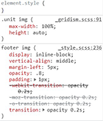
They have used a hover psuedo-class to change the color to lighter gray when moused over. However, I do not know what the & sign is in front. There is an inline block display for the GitHub image to be aligned to the right, have an 80% opacity prior to hovering, and a 1px padding around it.
Discussion
The search engine for documents in Jekyll leads you to the home page where you either sign in or sign up for a registered account. Once you have logged in, you may access documents, tutorials, and whatever??. Honestly, there is so much to take in at GitHub, I did not investigate any further at this time.
Techniques Used
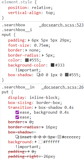
The developers have used an 'input' tag attribute for the user to enter whatever they want to search, whether it be documents, tutorials, or templates. They list suggestions as you enter letters and key words to find what you are looking for, and will investigate further, but I did not find how they coded that part of the search to just pop up suggestions as to what you are looking for.
Discussion
I was curious how they set up the feedback input. I hovered over and it turned a deep orange, to highlight and show the it was a link. Selecting it then brought me to a home page to sign in before you can put your two cents in. :-) You can sign up if you don't have an account, but to interact with the site, you must register or have an account already set up.
After creating an account and selecting improve this page , (This can be accessed via either the resources or docs tabs), that brought me to a page where I can give feedback on code. However, I see a message that I need to 'fork this repository before I make any changes'. I thought that was kind of rude, but funny!
Techniques Used
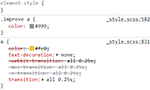
The developers have used a hover pseudo-class to change to orange if hovered over, identifying a link. However, the improve this page box has a lt gray default until hovered, unlike the other links on this page. The class selector .improve, codes for padding and font-size adjustments, combined with the anchor tag that codes for the lt gray color override. Last one wins?
Discussion
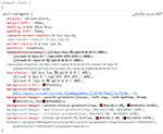
The maroon tab that has RELEASE on it, caught my attention. The tab has a lot going on in the space it takes up. The link leads to a new updated version of Jeckyll, fixing issues and bugs for the user of their services. Just by looking at the page without inspecting the code, I can tell that there is a color gradient going on, a box shadow, and negative padding for the overlap of the banner.
Techniques Used
The developers have used a color gradient (two colors and transparency) at different values to create the burnt orange gradient. They have created a very small box shadow that is surrounding the banner, and negative padding for positioning of the overlap of the banner on the left margin in this example. Other class attributes are utilized in the CSS file for the RELEASE wording, positioning, and font styling, such as caps.